
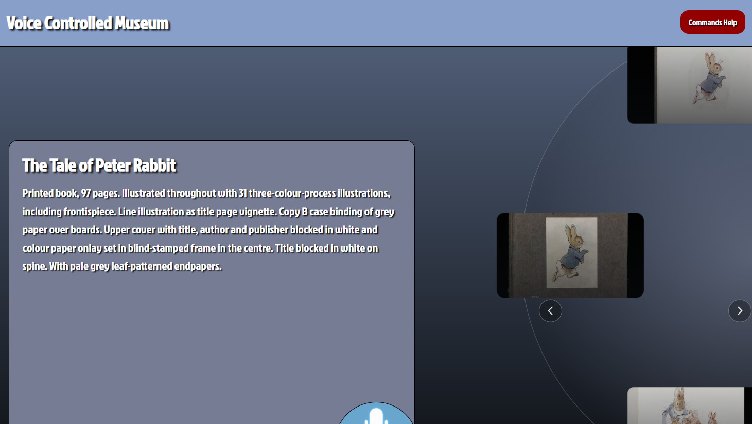
Voice Controlled Museum
Take me there now!This project involved doing user research to gather an understanding of what users experience with voice controlled systems was, and how they would expect to interact with such a system. After identifying key pain points participants had personas were created to aid the design process. The build of the project was built using HTML, CSS ,and javascript as a full back end was not required. The Annyang voice library was used for voice commands, and the Victoria & Albert museum API was used for museum content.
A questionnaire was created to gather information about the target audience and better understand the expectations users had for the site. This aided the design process by identifying common frustrations, preferences, and goals from potential users before development began. And to find out which features help them feel confident when searching for artefacts. The responses collected helped inform design decisions throughout the project and ensured the interface was designed around user needs rather than assumptions.
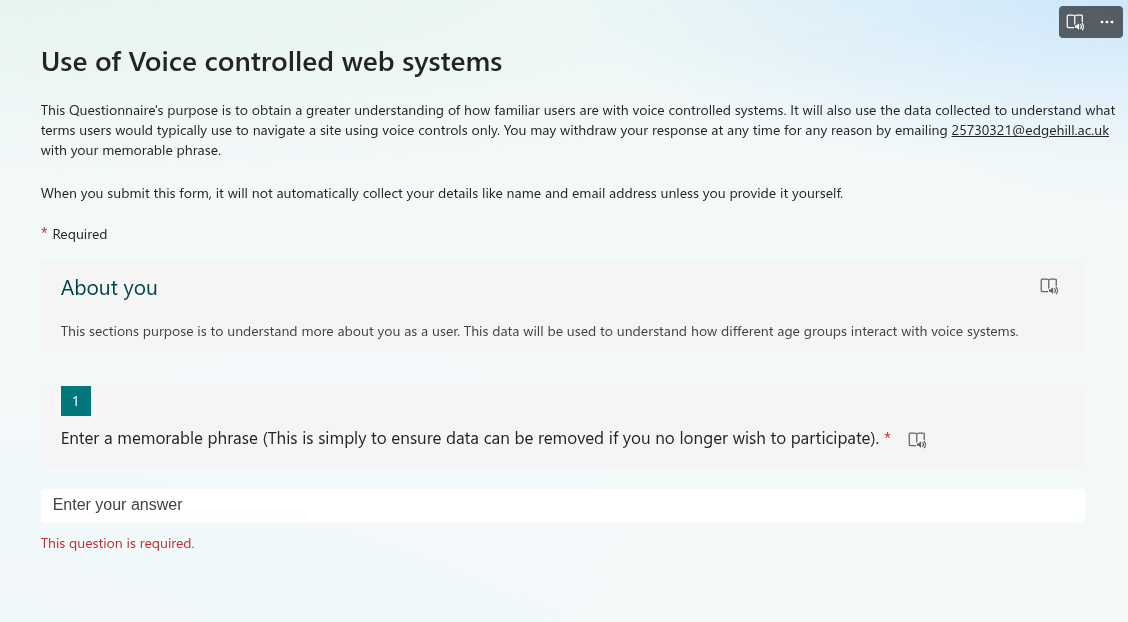
User Research
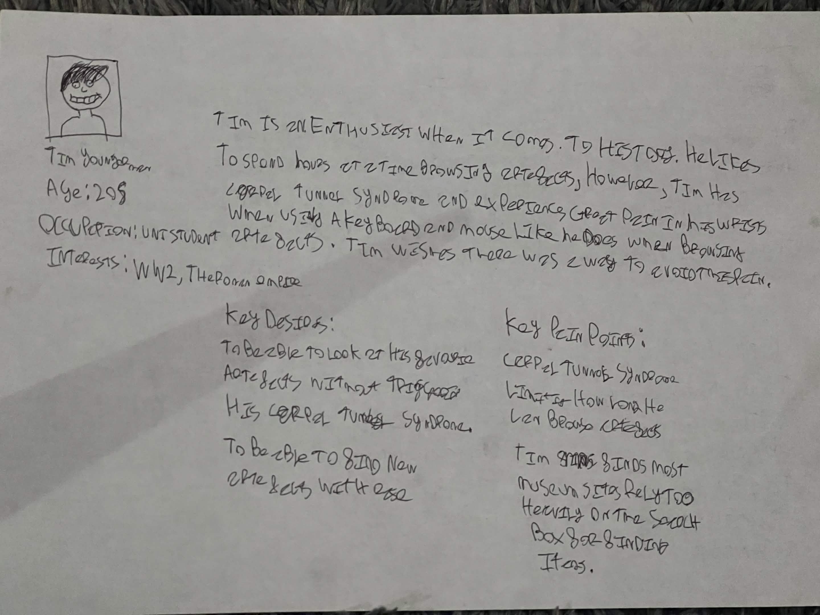
Personas
The site is designed for all ages, two personas were created based on the user research collected during the questionnaire. One of which is a younger person, who is good with technology, and an older person, who was not. This was decided Because older participants of the questionnaire stated they didn't use voice controlled systems often and were not confident with them.
An empathy map was created to further understand the users philosophy. This aided in the design process as it allowed me to deepen my understanding of the persona created. This empathy map helped create an understanding of how the user might think and feel during their visit to the site, and what they would do while browsing the site.
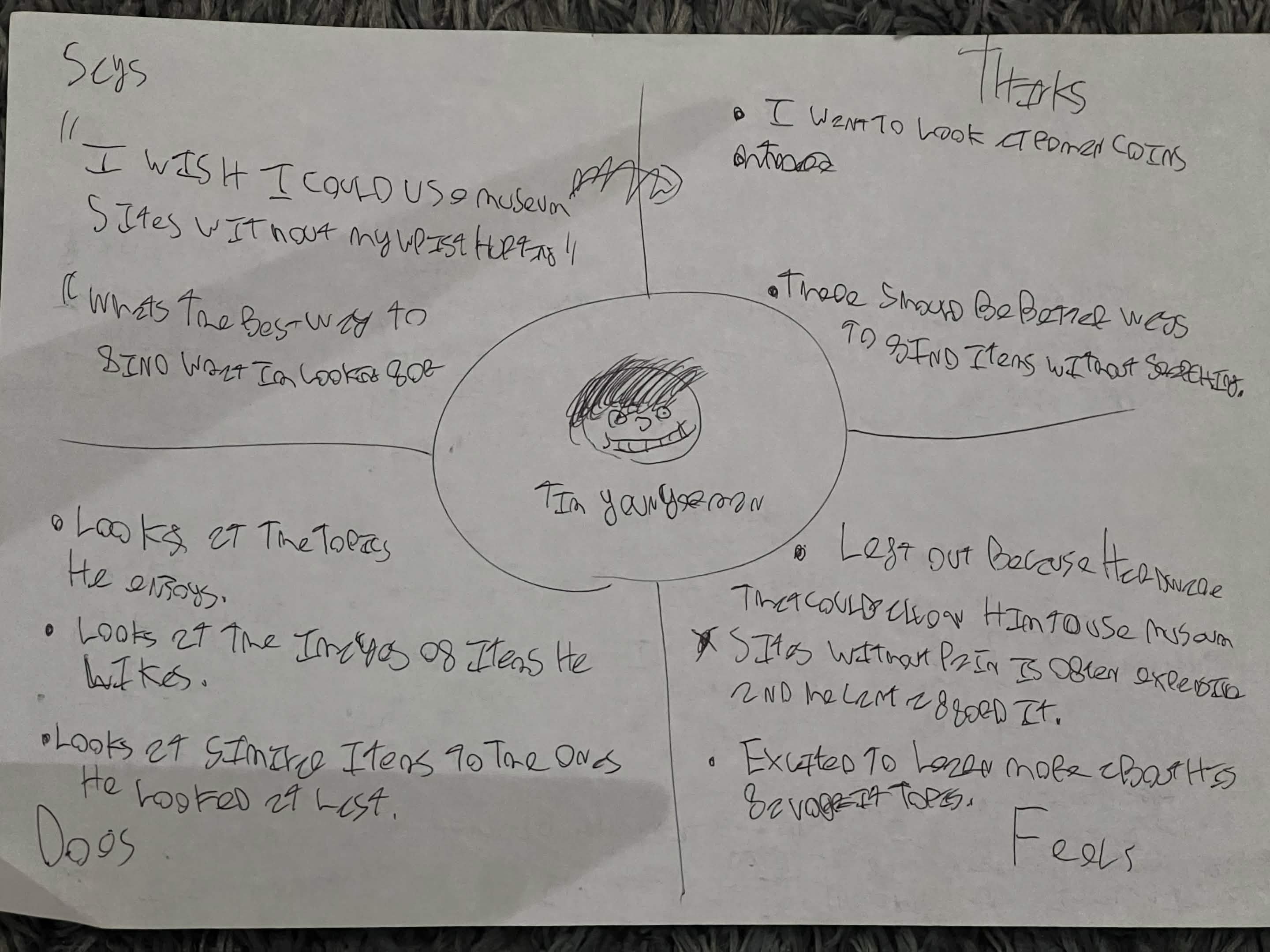
Empathy Map
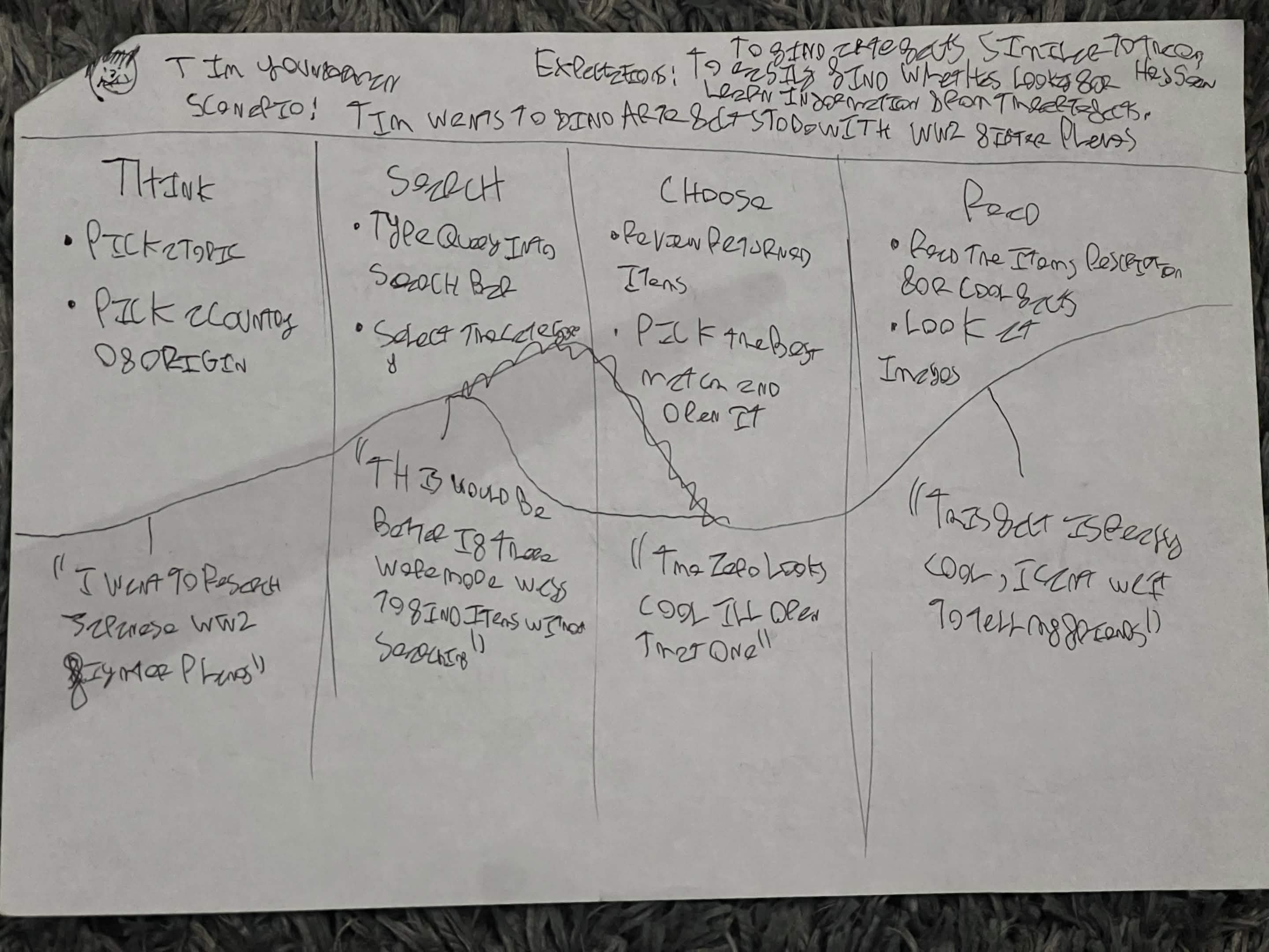
User Journey Map
The user journey map created for the user helped map out how the user would feel at different stages of using the site. This is used to identify key areas of the site to reinforce with user centred design principles to create a frictionless experience for the user.
Sketching the initial designs using pencil and paper is an efficient way to create a permanent idea of what the basic design for the site could look like. Pencil and paper helps as the first step of interface design as there is a low barrier from idea to visualisation. This makes creating wireframes and low fidelity prototypes a much easier process.
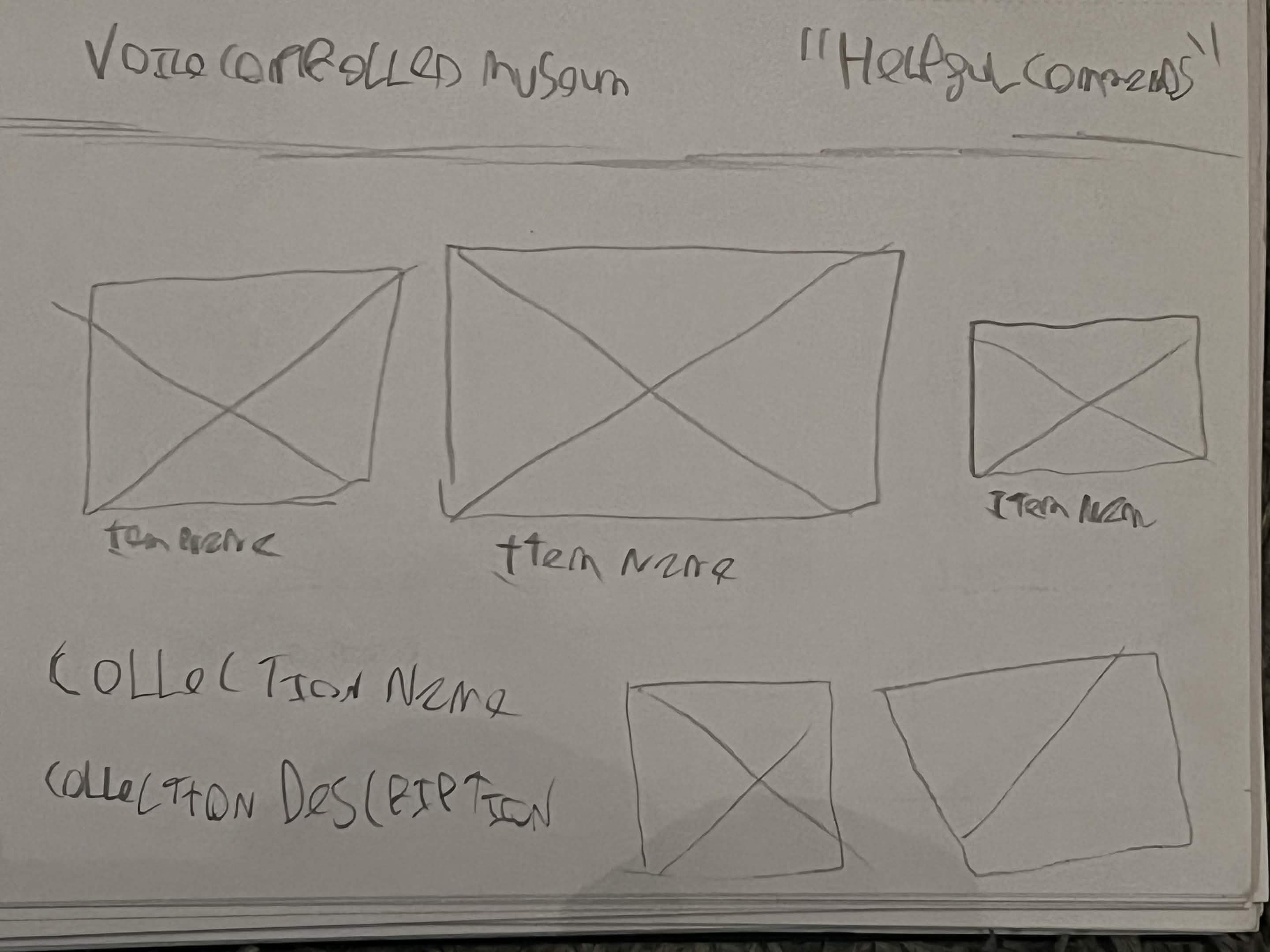
Sketches
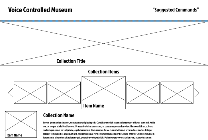
Wireframes
Creating the wireframes for the site was the first step towards a final design for the site, allowing the sites interface to start to form. The wireframes were created using Figma to not only create the first, but to plan early ideas of how the HTML & CSS layout of the site would be actioned.
The Figma prototype is where design of the site was finalised, and considerations for aspects of the design, such as font family and colour. The prototype is also given basic interactions in Figma’s prototype design tab.
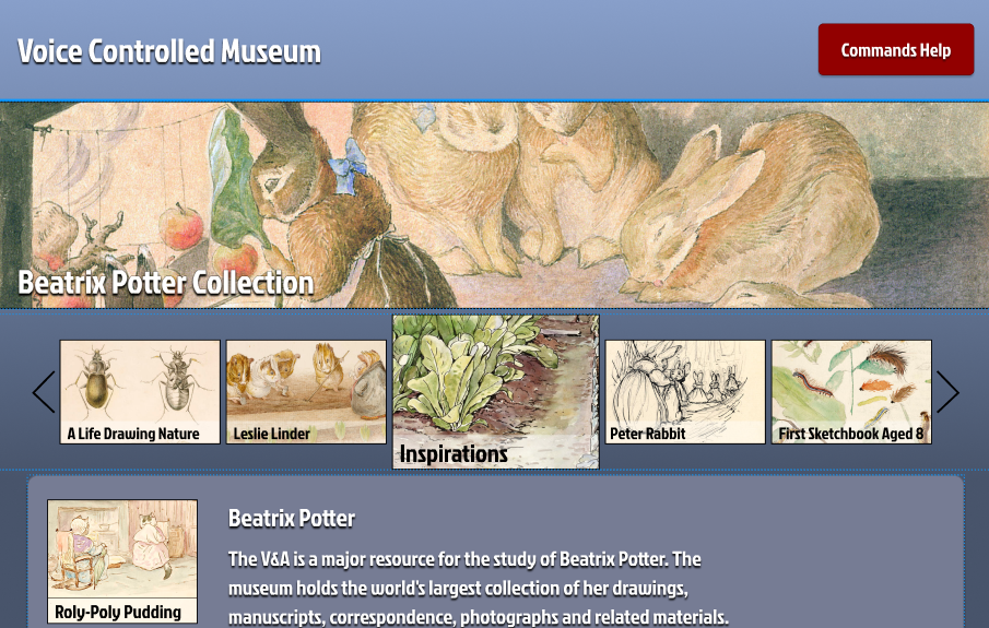
Figma Prototype
Usability Testing
Usability testing was carried out on the Figma prototype using the think aloud protocol to understand how users interacted with the interface. Participants were asked to complete a series of tasks while verbally explaining their thoughts, allowing areas of confusion and friction to be identified . This testing helped evaluate whether navigation, layout, and interactions were intuitive before development of the final build began. Feedback gathered during these sessions informed changes to the structure and flow of the prototype to create a clearer and more user focused experience.
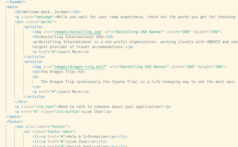
The site was then built using HTML, CSS, and Javascript to ensure an accessible, user focused experience that meets all the user needs identified in the design stages. The sites main interactive features were implemented using Javascript.
Site Build
Usability Testing
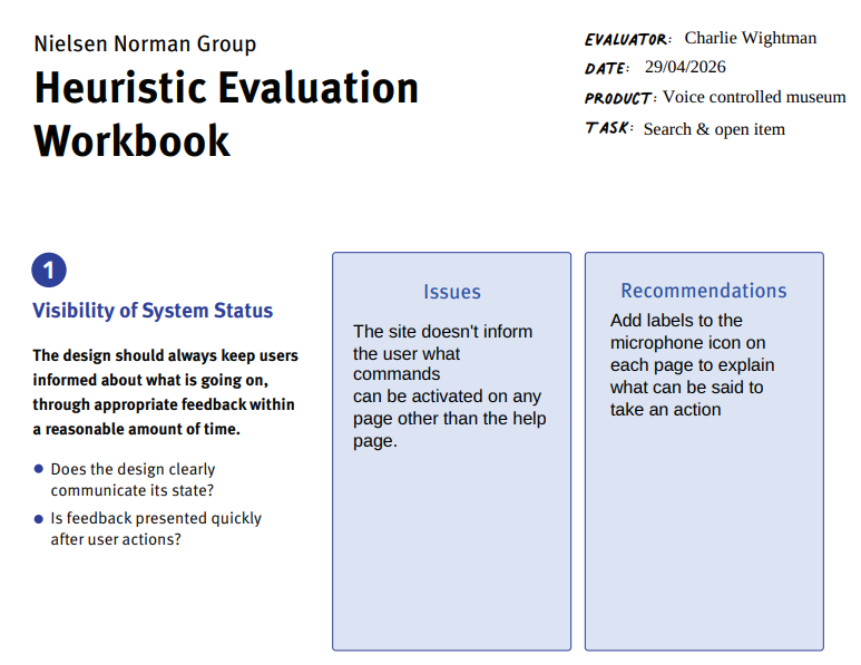
Usability testing was conducted on the completed site build using a combination of think aloud protocol sessions, questionnaires, and heuristic evaluation methods. The think aloud testing allowed users to describe their thought process while completing tasks on the live site, helping identify usability issues that were not present during the prototype stage. Questionnaires were then used to gather structured feedback on the overall experience, accessibility, and ease of navigation. A heuristic evaluation was also completed to assess the site against established usability principles, ensuring the interface remained consistent, efficient, and user centred throughout the final implementation.